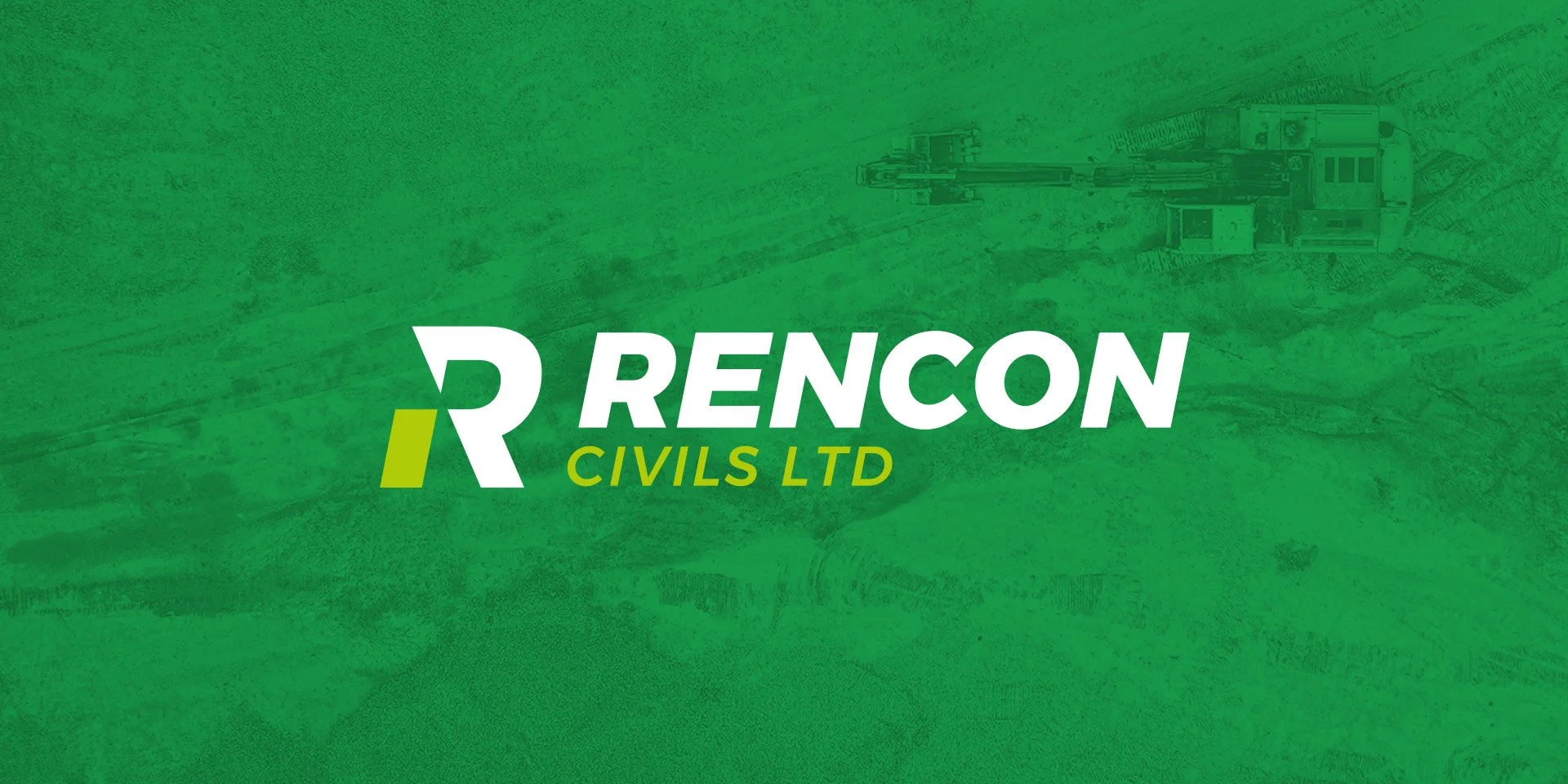
Rencon Civils
This project saw a complete rebrand of an established Fermanagh based business. Trading for many years as The Spray Doctor the business has grown and added new services so was in need of a new name as well as a new visual identity.
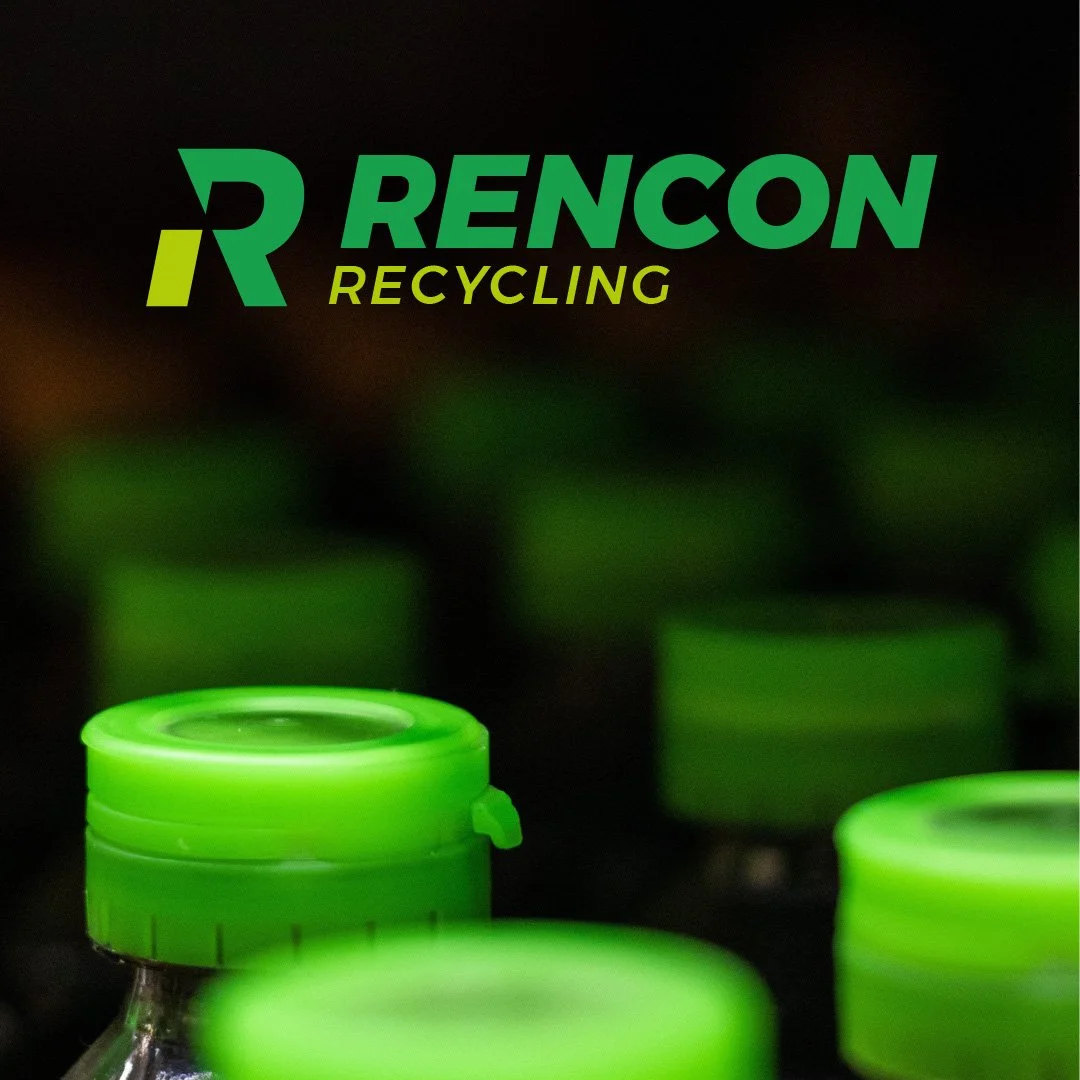
The business needed to standout on a busy site, with the logo used on the side of plant machinery, recycling bins and pest control boxes.
BOLD - SOLID - INDUSTRIOUS - NO NONSENSE
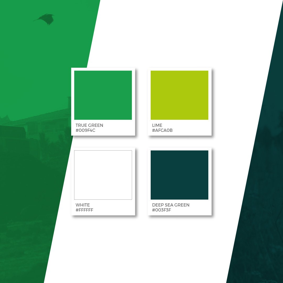
The true green colour was the only element brought through from the original branding. It’s a nod to the Fermanagh roots of the business and also keeps on visual element to visually connect the old to the new. This has been paired with a lime green for added zing.
A heavy sans serif typeface has real presence and packs a punch while the slant of the italic adds a degree of fluidity which means the overall look isn’t too heavy and dense. The R icon is instantly recognisable - something that was important for use on a construction site. It can be used stand alone while being instantly recognisable.
The logo has the flexibility to be able to be used for all the activities of the business; Civils, Recycling and Pest Control. And there is always the ability to add to this while remaining visually consistent as the business continues to grow.