Nature’s Choice
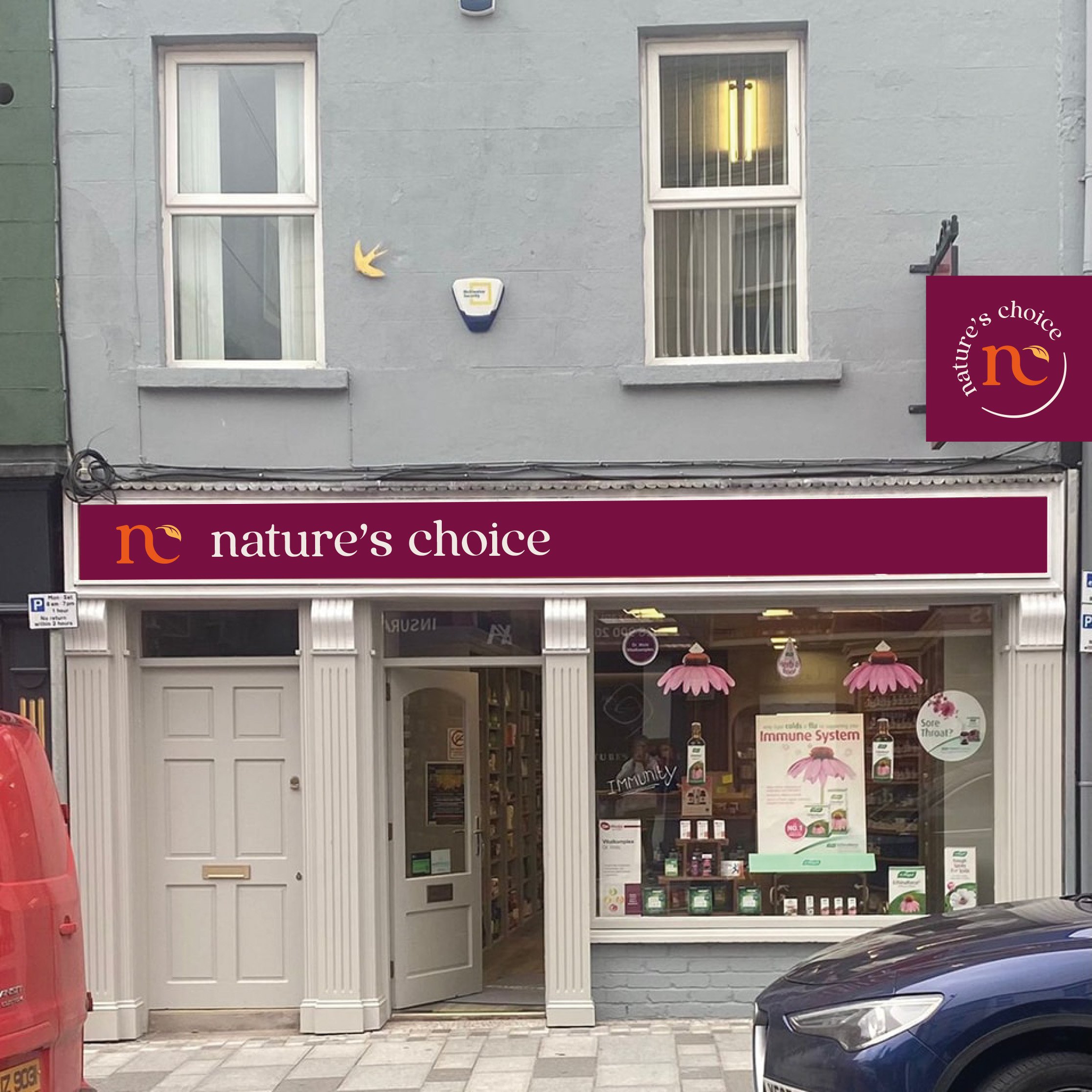
Nature’s Choice is an Award Winning Independent Health Shop, an established and well known presence on Enniskillen High Street. Run by Nuala who has a pharmacy background, Nature’s Choice is not the typical cliche hippie health food shop. Offering a clinical approach, the business is much more than just a shop - it offers trusted advice and reassurance to the local community on all aspects of supplements and alternative health, allowing customers to support themselves in tandem with the traditional health care system.
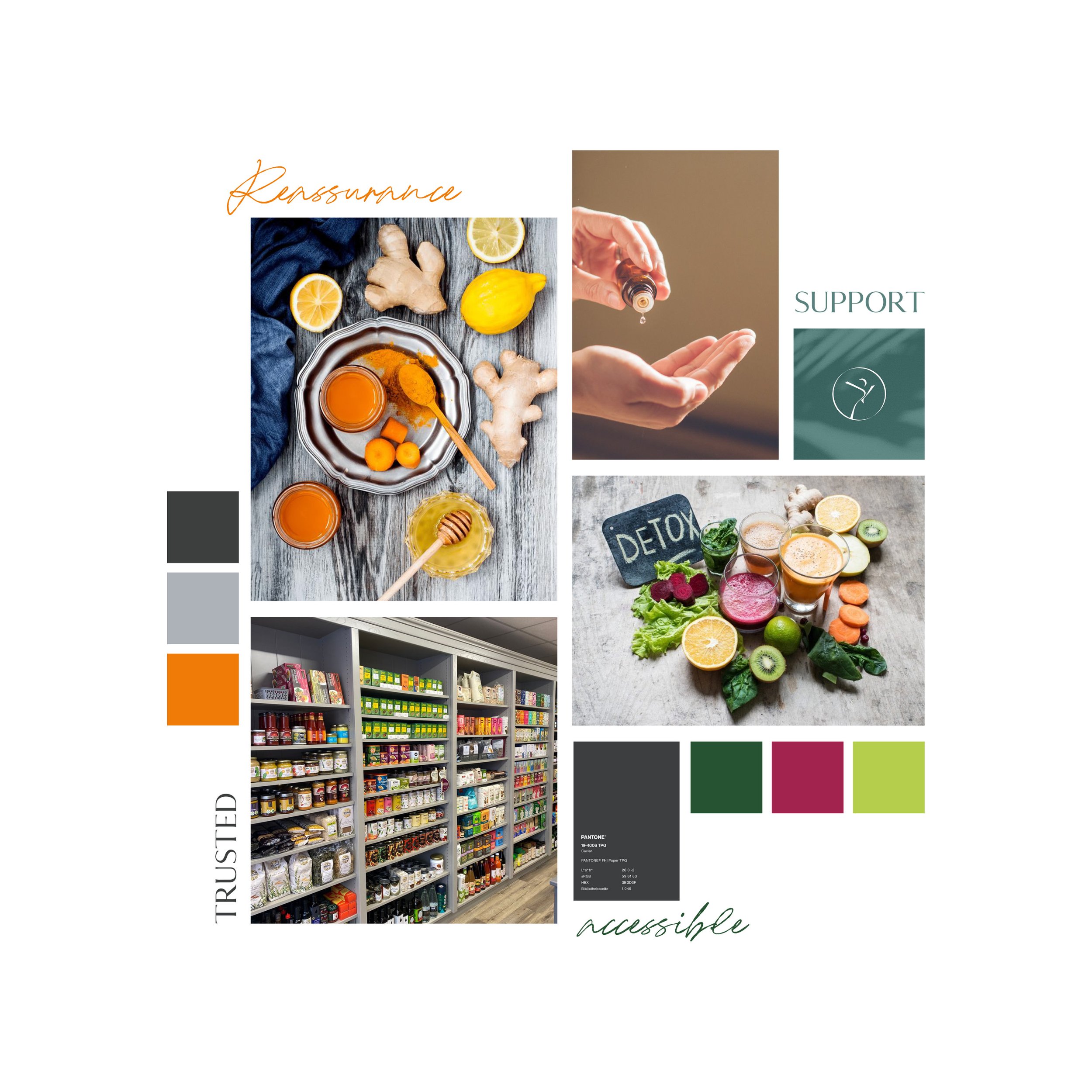
ACCESSIBLE - REASSURANCE - SUPPORT - TRUSTED
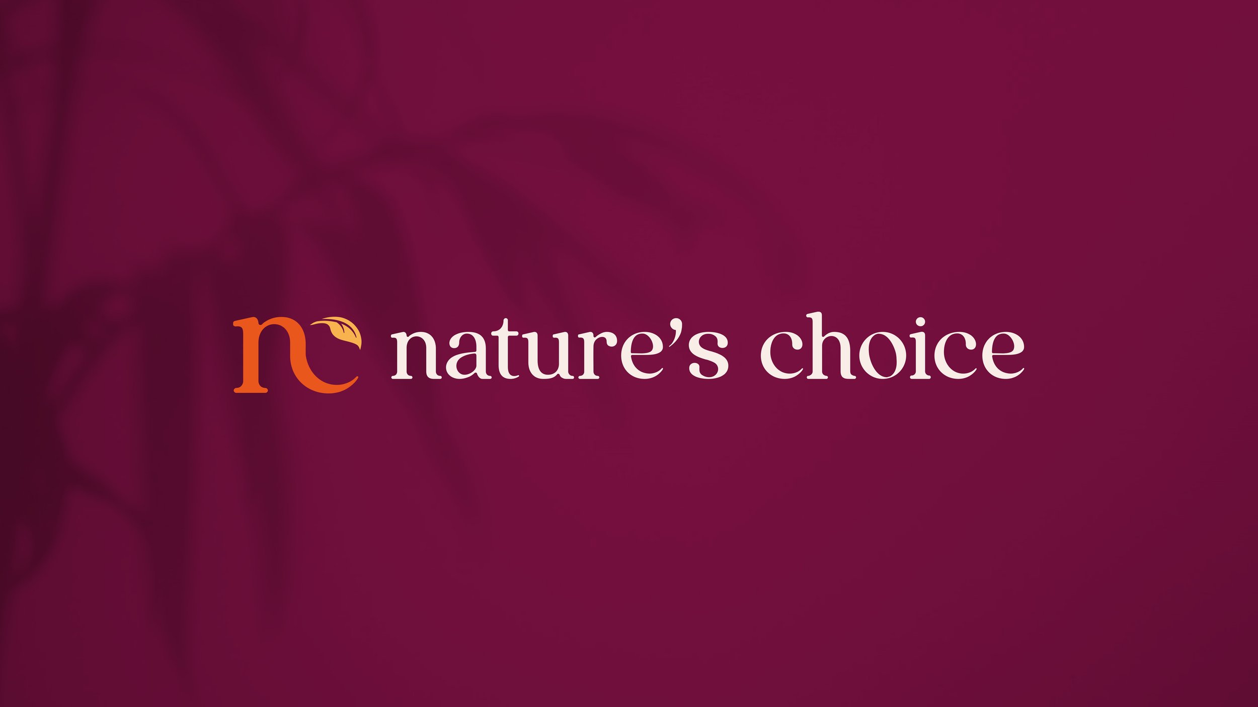
“Classical with a quirk” as well as “ordered and tidy” were two sound bites from our initial meeting that stuck in my mind. This along with the desire to visually differentiate from others in the sector (the Mother Earth, hippie vibe that’s so often employed) lead to the development of a typography led logo.
The serif typeface is soft, fluid and feminine. The text is all lower case which adds to the softness and feeling of approachability. The “nc” icon subtly uses a curled leaf shape as a nod to the nature aspect of the business, without it being too dominant.
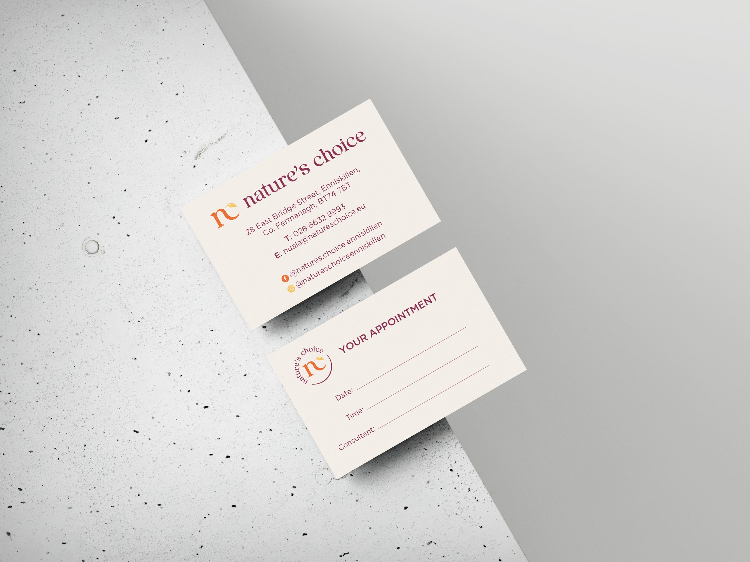
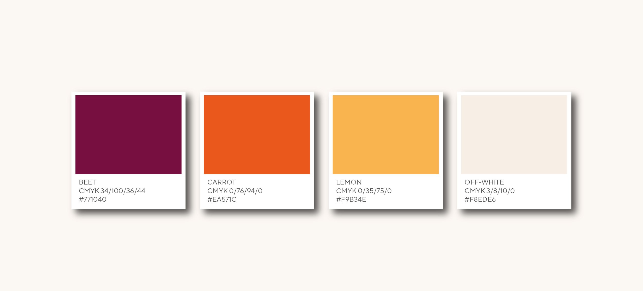
When it came to colour, green was the obvious choice; the link to nature and the little leaf in the icon would both lead to that choice. However, that is too obvious and in my opinion, overused in the sector. Instead I exposed warm colours, inviting and nurturing. The palette of beetroot, carrot and lemon, used on off white is striking but not gaudy. The warmth of the colours provides another layer of approachability.
The end result is polished and confident and the client agreed that we achieved “classical with a quirk”
